
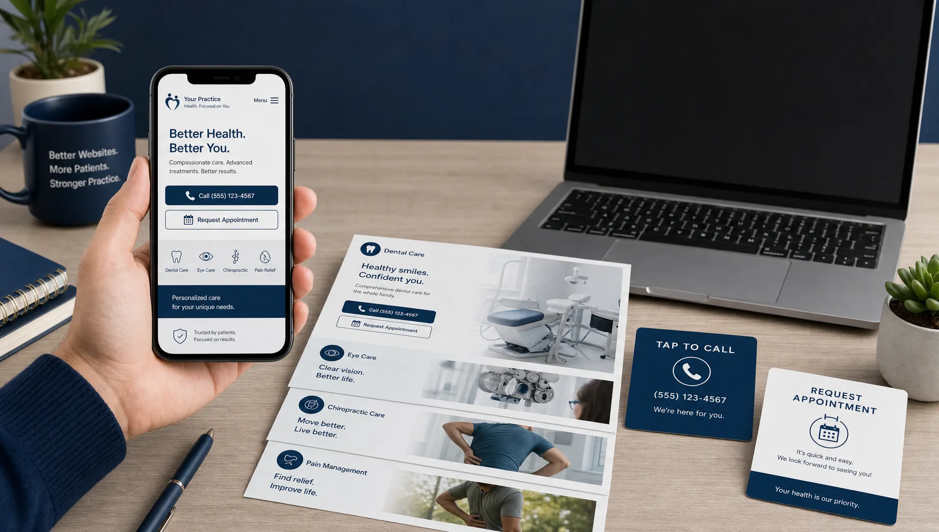
A practice website can look polished on a desktop and still lose patients on the device they actually use. If a new patient has to pinch, zoom, hunt for the phone number, wait for a slow page, or fight a form that was built for a keyboard, the design is not doing its job.
For dentists, orthodontists, optometrists, pain physicians, and specialty clinics, responsive web design is not just a technical preference. It is part of the appointment pipeline. The goal is simple: make every page easy to understand, easy to trust, and easy to act on from any screen.
That matters because many patients search when they have immediate intent. They are comparing providers during a lunch break, after work, between errands, or while a family member is dealing with discomfort. According to Pew Research Center mobile data, smartphone ownership is now nearly universal among U.S. adults, which means your mobile experience is often your first impression.
Responsive web design is a booking problem, not a layout problem
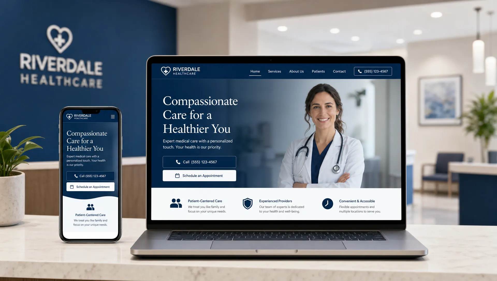
Responsive web design means your website adapts to different screen sizes, devices, and orientations. But for a healthcare practice, the definition should go further. A responsive site should adapt to the patient’s decision process.
A desktop visitor may be researching implants, LASIK, physical therapy, or orthodontic treatment in detail. A mobile visitor may be trying to call now, confirm your location, check insurance, read reviews, or book a consultation before choosing another practice. Both need the same brand clarity, but they do not always need the same layout priority.
Google also recommends responsive design as a mobile-friendly setup because it uses the same URL and HTML across devices, with layout handled by CSS. That simplifies crawling, indexing, and user experience compared with separate mobile URLs. You can see this reflected in Google Search Central’s mobile site guidance.
The practical takeaway: responsive design should support local visibility, patient trust, and conversion. If your site is responsive only in the sense that it shrinks, it may still be creating friction at the exact moment a patient is ready to act.
Start with the mobile patient journey
Before redesigning buttons or breakpoints, map the path a patient takes from search to appointment request. A responsive site should answer the patient’s biggest questions quickly, especially on mobile.
Most patients are trying to answer a short list of questions:
- Do you treat my problem or offer the service I need?
- Are you close enough and convenient enough?
- Do you look credible, safe, and experienced?
- Can I call, request an appointment, or get directions without hassle?
Those questions should shape the mobile layout. A dental emergency page should not bury the phone number under a large hero image. A chiropractic page should not make users scroll through a long philosophy section before they see conditions treated. An ophthalmology page for cataract surgery should make consultation next steps clear before overwhelming the visitor with every technical detail.
This is where responsive design connects directly to broader patient acquisition strategies for growing healthcare practices. Search visibility creates the opportunity, but the page experience determines whether that opportunity becomes a call, form submission, or booked visit.
Put the primary action within thumb reach
On mobile, the most important design elements should be easy to tap with one hand. For a practice website, that usually means the phone number, appointment request, directions, and sometimes patient portal access.
A strong responsive design often includes a simplified mobile header with a clear call button and appointment button. If you use a sticky mobile bar, keep it focused. Too many options can be just as harmful as too few. A patient deciding between three local providers does not want to decode a miniature desktop menu.
Use one primary action per page whenever possible. For example, a dental implant page may focus on scheduling a consultation, while an emergency dental page may prioritize calling immediately. A physical therapy page may lead with request an evaluation, while a dry eye clinic page may guide visitors toward an appointment request.
Desktop pages can support more secondary actions because there is more space. Mobile pages need hierarchy. The patient should never wonder what to do next.
Make forms short, tap-friendly, and appropriate for healthcare
Forms are one of the most common places responsive design fails. A form may technically fit on a phone, yet still feel frustrating because fields are too small, labels disappear, dropdowns are hard to use, or the form asks for too much information too early.
For appointment requests, fewer fields usually convert better. Ask for the information your front desk needs to respond, not every detail your intake process will eventually require. Name, phone, email, preferred location, desired service, and a short message may be enough for a first step, depending on your workflow.
Healthcare practices should also be thoughtful about privacy. Avoid encouraging patients to submit sensitive medical details through a general contact form unless the form and process are designed to handle that appropriately. A simple note can tell patients not to include urgent or sensitive health information and to call for immediate concerns.
Responsive form best practices include large input fields, visible labels, proper keyboard types for phone and email fields, clear error messages, and a confirmation message after submission. If the form fails silently or reloads without feedback, patients may assume the request did not go through and move on.
Improve page speed before adding more design elements
Fast sites feel more trustworthy. Slow sites feel neglected, especially on mobile connections. In healthcare, that impression can transfer to the practice itself, whether or not that is fair.
Responsive web design should include performance decisions from the start. Large uncompressed images, excessive animation, third-party scripts, heavy fonts, and bloated page builders can turn an attractive design into a slow experience. Patients do not care how beautiful the hero image is if it delays the phone number, directions, or appointment button.
Focus on the elements that have the biggest impact:
- Compress and properly size images for mobile screens.
- Use modern image formats when practical.
- Limit unnecessary scripts, popups, sliders, and tracking tags.
- Load critical content first, including the headline and call to action.
- Test pages on real phones, not only in a desktop browser preview.
Speed is also important for paid traffic. If you run Google Ads to a slow landing page, you may pay for clicks that never become leads. For organic search, speed is one part of the overall page experience, but for patients it is immediate and obvious.
Design for credibility on every screen
Healthcare decisions require trust. A responsive website should preserve credibility signals when the layout collapses from desktop to mobile. Too often, important trust elements disappear or become hard to find on smaller screens.
Trust signals can include provider photos, credentials, reviews, before-and-after examples where appropriate and compliant, insurance information, patient testimonials, location details, and clear explanations of what happens next. These elements should not feel like decorations. They should reduce uncertainty.
The principle applies across high-trust service industries. Healthcare practices face an even higher trust bar because patients are evaluating comfort, safety, expertise, and access to care.
On mobile, credibility must be concise. Instead of stacking every review on the homepage, show a strong review summary near the top and link to more proof. Instead of listing every credential in a dense paragraph, use scannable provider cards. Instead of hiding location details in a footer, put them near the action area on location-specific pages.
Keep navigation simple and service-focused
A responsive menu should help patients choose a path quickly. Many practice websites overload their menus with internal labels, long service lists, or pages that matter more to the organization than to the patient.
For most healthcare practices, mobile navigation should highlight services, insurance or payment information, reviews, new patient resources, locations, and contact options. If you have multiple locations, make location selection easy. If you serve several specialties, group services in patient-friendly categories.
Service pages deserve special attention. A page for Invisalign, dental implants, cataract surgery, dry eye treatment, sciatica care, regenerative medicine, or sports injury rehab should not feel like a generic brochure. It should explain symptoms or goals, who the service is for, what to expect, and how to take the next step.
If your practice is evaluating a larger redesign, this is also where choosing the right partner matters. A healthcare site needs more than visual polish, as explained in this guide to website design Louisville KY practices can trust in 2026.
Match responsive features to the type of practice
Different specialties have different booking behaviors. Responsive design should reflect the urgency, complexity, and decision timeline of the service line.
| Practice type | Common mobile patient intent | Responsive design priority |
|---|---|---|
| General dentistry | Find a nearby dentist, confirm insurance, call for an issue | Prominent call button, insurance cues, location details, emergency path |
| Orthodontics | Compare options for a child or adult treatment | Consultation CTA, before-and-after proof where appropriate, financing information |
| Optometry and ophthalmology | Schedule an exam or research a procedure | Clear service paths, provider trust, appointment request, directions |
| Chiropractic and physical therapy | Get help for pain, injury, or limited mobility | Condition pages, simple evaluation request, click-to-call, map access |
| Pain management and specialty care | Understand treatment options and referral requirements | Clear next steps, credibility signals, concise explanations, secure contact flow |
The table is not a rigid rule. It is a reminder that responsive design should be based on patient intent, not just screen width. A mobile layout for an emergency dental page should feel different from a mobile layout for elective cosmetic dentistry. A LASIK page should support education and confidence, while a same-week chiropractic appointment page should reduce friction and emphasize access.
Use responsive content, not just responsive containers
Many websites technically adapt to mobile because the columns stack. But the content itself is still written for a desktop visitor with time to read. That is a problem when mobile users are scanning quickly.
Responsive content means headlines, summaries, buttons, and page sections are arranged for fast comprehension. Use plain language in headings. Break long paragraphs into shorter sections. Put the most important details before expandable content. Make sure FAQs are easy to scan on mobile, especially when patients are comparing providers.
This does not mean dumbing down medical information. It means layering it. Start with the patient’s concern, explain the service clearly, then offer deeper detail for visitors who want it. For example, a page about dental implants can first answer who implants are for and how to schedule a consultation, then explain bone health, timelines, and restoration options farther down the page.
Build responsive landing pages for ads and campaigns
If your practice runs Google Ads, social ads, direct mail, or referral campaigns, do not send every visitor to the homepage. A responsive landing page can match the patient’s intent more closely and reduce distractions.
A strong mobile landing page should have a focused headline, concise benefit statement, proof elements, short form, click-to-call option, location context, and a clear next step. Remove anything that does not help the patient decide. This is especially important for high-intent searches such as emergency dentist near me, chiropractor for sciatica, LASIK consultation, or physical therapy near me.
Responsive landing pages also make tracking easier. When each campaign has a clear destination and action, you can see which services, locations, and messages produce real patient inquiries.
Do not ignore accessibility
Responsive design and accessibility often overlap. Patients may be using small screens, older devices, screen readers, larger text settings, or unstable connections. A site that is hard to read or navigate can exclude people who would otherwise become patients.
Use readable font sizes, strong color contrast, descriptive link text, alt text for meaningful images, keyboard-friendly navigation, and clear focus states. Avoid placing important text inside images. Make buttons look like buttons. Do not rely on color alone to communicate errors or required fields.
Accessibility is not only a compliance consideration. It is good patient experience. A person with eye strain searching for an optometrist, a patient in pain searching for a chiropractor, or a parent trying to schedule a pediatric dental appointment should not have to fight the interface.
Measure appointments, not compliments
A responsive redesign should be judged by patient behavior. Compliments from staff and vendors are nice, but they do not prove the website is helping the practice grow.
Track the actions that connect to revenue and schedule health: phone calls, appointment form submissions, booked consultations, direction requests, service page engagement, and conversion rate by device. Compare mobile and desktop performance separately. If desktop converts well and mobile does not, the issue may be layout, speed, forms, or call visibility.
Also review call quality and follow-up. If the website generates more inquiries but the front desk misses calls or responds slowly, the patient acquisition system still leaks opportunities. That is why medical practice marketing should be measured by booked appointments, not just traffic, clicks, or design preferences.
Responsive web design checklist for patient booking
Use this checklist to evaluate your current website from a patient’s phone, not from your office desktop.
- Can a mobile visitor understand what you do within five seconds?
- Is the phone number visible and tap-to-call on key pages?
- Is the appointment request button easy to find without scrolling too far?
- Do service pages explain the patient problem, treatment option, and next step clearly?
- Are forms short, readable, and easy to submit on a phone?
- Do pages load quickly on mobile data, not only office Wi-Fi?
- Are reviews, credentials, provider information, and location details easy to find?
- Does the mobile menu use patient-friendly labels?
- Are buttons large enough to tap without mistakes?
- Are conversions tracked by device, source, service, and location?
If several answers are no, your website may be responsive in code but not responsive to patient needs.
Frequently Asked Questions
What is responsive web design for a healthcare practice? Responsive web design means your practice website adapts to phones, tablets, laptops, and desktop screens. For healthcare, it should also make core patient actions easy, including calling, requesting an appointment, finding a location, reviewing services, and building trust.
Does responsive design help SEO? Yes, responsive design can support SEO by improving mobile usability, simplifying site structure, and creating a better experience for visitors from search. It is not the only SEO factor, but it helps patients and search engines access the same content cleanly across devices.
What is the most important mobile design feature for booking patients? The most important feature is a clear next step. For many practices, that means a tap-to-call button and a visible appointment request button. The right priority depends on the service, urgency, and patient journey.
How often should a practice review its mobile website experience? Review it at least quarterly and whenever you add services, launch ads, change scheduling workflows, or open a new location. You should also test mobile pages after major website updates because small layout changes can affect calls and forms.
Can a responsive website replace local SEO or Google Ads? No. Responsive design helps convert visitors, but you still need visibility. Local SEO, Google Business Profile optimization, ads, reviews, and follow-up systems all work together. A responsive website makes those channels more effective by turning more traffic into patient inquiries.
Turn your practice website into a better booking system
Your website should not simply look good on every device. It should help the right patients find the right service, trust your practice, and take the next step with less friction.
If your mobile site is slow, confusing, or underperforming, Louisville Web Lab can help you identify where patient opportunities are being lost and what to fix first. Book a diagnostic strategy call with Louisville Web Lab to review your website, search visibility, and patient acquisition system.