

Most healthcare practices do not have a traffic problem first. They have a leakage problem.
A dental office may be ranking on Google but losing mobile visitors who cannot find the phone number. A chiropractor may be paying for Google Ads while sending back pain patients to a generic homepage. An optometry clinic may have strong reviews but hide them below a wall of stock photos. In each case, the issue is not more exposure. It is that the website is not turning existing attention into calls, forms, and booked appointments.
That is the practical meaning of website design for conversion: designing every page around the next decision a patient needs to make. Before investing in a full redesign, more ads, or another SEO campaign, fix the leaks that are already costing you patients.
What a conversion leak looks like on a healthcare website
A conversion leak is any moment where a qualified visitor wants help but drops off because the website adds confusion, friction, or doubt.
For healthcare practices, these leaks are often subtle. Patients are not shopping casually. They may be in pain, embarrassed about a dental issue, anxious about cost, or comparing providers during a short break at work. If the page does not answer the obvious next question, they return to Google and choose another practice.
Common leaks include slow mobile pages, vague headlines, buried phone numbers, unclear insurance information, weak trust signals, long forms, and service pages that do not match what the patient searched for.
Here is a simple way to diagnose the most common problems:
| Conversion leak | What the patient is thinking | Fix first |
|---|---|---|
| Vague first screen | “Am I in the right place?” | State the service, location, and patient outcome clearly above the fold |
| Hard-to-find contact options | “How do I schedule?” | Add visible call, form, and booking paths on mobile and desktop |
| Generic service pages | “Do they treat my exact issue?” | Build pages around specific conditions, treatments, and patient intent |
| Weak proof | “Can I trust this provider?” | Place reviews, credentials, photos, and outcomes near decision points |
| Long forms | “This is too much work.” | Reduce fields and make the next step feel low-risk |
| Slow pages | “This site feels broken.” | Compress images, simplify scripts, and improve Core Web Vitals |
The goal is not to make every visitor convert. The goal is to stop losing the right visitors for preventable reasons.
Start with the first screen: the five-second patient test
When someone lands on a healthcare website, they should understand five things almost immediately:
- What you do
- Who you help
- Where you are located
- Why they should trust you
- What to do next
If your homepage or landing page cannot pass that test within a few seconds, the rest of the design has to work too hard.
A strong first screen for a practice does not need to be clever. It needs to be specific. For example, “Family and Cosmetic Dentist in Louisville” is more useful than “Creating Smiles for Life” if the visitor is quickly trying to confirm relevance. “Same-week appointments for back pain and sciatica” is more persuasive than a generic wellness message for a chiropractic or pain practice.
This is especially important on mobile, where the first screen may only show a headline, a small image, and one button. If that space is filled with vague branding, stock imagery, or a rotating slider, you may be losing high-intent patients before they ever see your services.
For healthcare practices that need to build trust quickly, Louisville Web Lab has a related guide on company web page design tips that build trust fast, which goes deeper into what belongs near the top of a page.
Fix the contact path before changing the visual design
A beautiful website can still leak appointments if patients cannot contact the practice easily.
For local healthcare, the contact path is usually more important than the color palette. Patients may want to call, request an appointment, ask about insurance, or confirm whether a specific treatment is available. If the website forces them to hunt for those options, conversion drops.
On mobile, the call button should be obvious. The appointment request should not require excessive typing. Location details should be easy to open in maps. If the practice has multiple providers or locations, the website should help patients choose without making them decode an internal office structure.
The most common mistake is treating the contact page as the only conversion page. In reality, every high-value service page should have its own contact prompts. A dental implant visitor should not have to navigate back to the homepage to schedule a consultation. A dry eye patient should not need to search the menu for a form. A physical therapy patient should not wonder whether the clinic accepts new patients.
Good conversion design creates repeated, natural opportunities to act. It does not mean placing a giant button every few lines. It means giving patients a clear next step after answering a question or reducing a concern.
If mobile usability is a known issue, this guide to responsive web design tips for booking more patients is a useful next step.
Match each page to the patient’s intent
One of the biggest website conversion leaks is sending every visitor to the same generic page.
A patient searching “Invisalign for adults near me” has different questions than someone searching “emergency dentist open today.” A person comparing LASIK providers has different concerns than someone looking for cataract surgery. A patient with chronic knee pain is not in the same mindset as someone researching sports injury rehab.
Conversion-focused design starts by matching the page to the search intent. That means service pages should not read like internal brochures. They should answer the patient’s real questions:
- Is this the treatment I need?
- What symptoms or conditions does it help?
- What happens during the first visit?
- How soon can I be seen?
- Does insurance apply?
- Why should I choose this provider?
- What is the next step?
This is where SEO and conversion overlap. A page that clearly addresses a specific treatment or condition often performs better in search and converts better once visitors arrive. Traffic only creates growth when the destination page matches the visitor’s intent.
For practices building out these pages, Louisville Web Lab’s article on lead generation website tips covers several core elements that turn visitors into inquiries.
Put trust signals where anxiety appears
Patients do not convert just because they find the right service. They convert when enough uncertainty has been removed.
Trust signals are often placed too late on healthcare websites. Reviews sit on a separate testimonials page. Provider credentials are buried under “About.” Before-and-after photos, when appropriate and compliant, may be hidden in a gallery instead of near the relevant service. Insurance or payment information is sometimes missing entirely.
A better approach is to place proof near the moment of anxiety.
For a cosmetic dentistry page, that may mean showing real reviews from patients who mention confidence, comfort, or results. For an orthodontic page, it may mean explaining experience with teens and adults. For a pain management page, it may mean clarifying what happens during the first evaluation and how treatment options are discussed. For an optometry clinic, it may mean highlighting advanced testing, doctor experience, or the conditions commonly treated.
Trust signals can include:
- Real patient reviews, used ethically and accurately
- Provider photos and bios
- Credentials, memberships, and years of experience when verifiable
- Clear explanations of procedures and expectations
- Location photos that make the office feel familiar
- Insurance, financing, or payment information when available
- Safety, accessibility, and comfort details
Be careful with claims. Healthcare websites should avoid exaggerated guarantees, misleading outcomes, or testimonials that imply everyone will get the same result. The Federal Trade Commission’s guidance on endorsements is a useful reminder that reviews and testimonials must be truthful and not misleading.
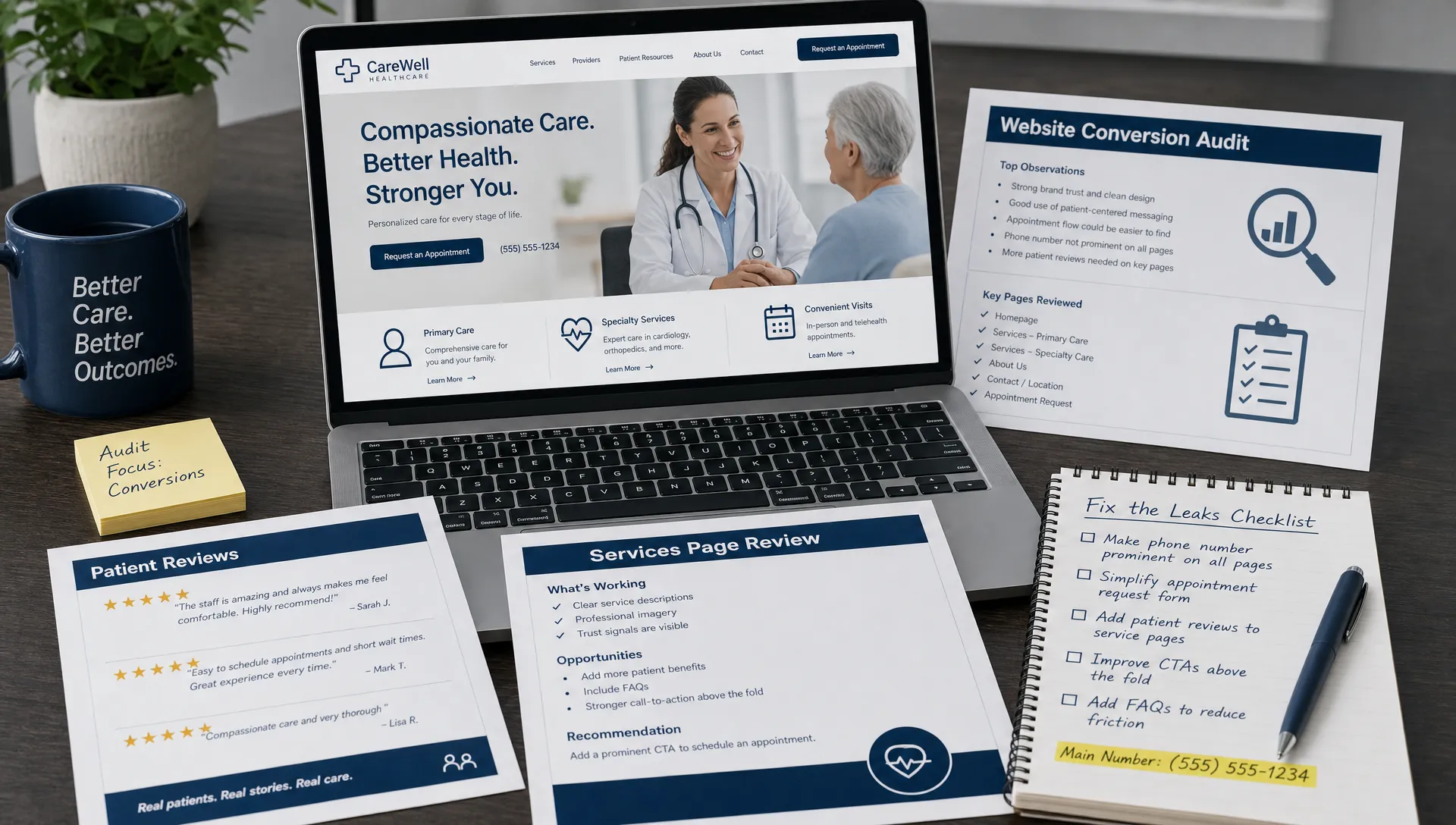
Stop sending paid traffic to leaky pages
Google Ads can expose website problems fast. If you are paying for clicks but not getting calls or appointment requests, the landing page may be the bottleneck.
A high-performing ad landing page should feel like a continuation of the search. If someone clicks an ad for “emergency dentist Louisville,” the page should focus on emergency dental care, availability, location, phone access, and what to do next. If they land on a general homepage with a broad menu and no urgency, the ad spend leaks.
The same applies to pain management, chiropractic, LASIK, dental implants, and physical therapy. Paid traffic is usually higher intent, but it is also less patient with friction. Every extra click, unclear headline, slow-loading image, or vague call to action can reduce return on ad spend.
| Paid traffic issue | Likely leak | Better conversion design |
|---|---|---|
| Many clicks, few calls | Page does not match the ad promise | Create dedicated landing pages for major campaigns |
| Form starts, few submissions | Form is too long or unclear | Ask only for essential information and clarify response time |
| High mobile bounce rate | Page is slow or hard to use on a phone | Improve speed, button placement, and mobile layout |
| Low-quality leads | Copy is attracting the wrong patients | Clarify services, location, insurance fit, and eligibility |
| Calls but few booked appointments | Tracking stops at the call | Review call quality, routing, and front desk follow-up |
Google recommends monitoring real user experience through Core Web Vitals, including loading performance, interactivity, and visual stability. These factors are not just technical SEO concerns. They directly affect whether a patient feels comfortable using the site.
Measure conversion like a practice, not a portfolio
Website design for conversion should be judged by practice outcomes, not just appearance.
A clean, modern website matters because it supports trust. But a healthcare practice also needs to know whether the site is producing the right actions. At minimum, practices should track calls, forms, appointment requests, and key page engagement. If possible, those inquiries should be connected to booked appointments so marketing decisions are based on revenue impact rather than vanity metrics.
The numbers to watch depend on your specialty and business model, but the categories are consistent:
| Metric | Why it matters | What it can reveal |
|---|---|---|
| Phone calls from website | Many healthcare patients still prefer calling | Whether contact options are visible and compelling |
| Form submissions | Shows demand from visitors who do not want to call | Whether forms are simple and trustworthy |
| Appointment requests | Closer to real business value than traffic | Whether the website is attracting ready patients |
| Service page conversion rate | Shows which pages persuade visitors | Which treatments or locations need better copy and design |
| Mobile conversion rate | Most local searches happen on phones | Whether mobile design is costing appointments |
| Call quality | Not every call is a good lead | Whether marketing is attracting the right cases |
Be cautious with tracking in healthcare. Forms, analytics, call tracking, and advertising pixels should be reviewed with privacy and compliance in mind. The U.S. Department of Health and Human Services has issued guidance on online tracking technologies for HIPAA-regulated entities, and practices should involve appropriate legal or compliance support when needed.
Fix leaks in the right order
Not every website problem deserves equal attention. If you try to fix everything at once, the project becomes expensive, slow, and unfocused. A better approach is to prioritize the leaks closest to revenue.
Start with pages that already get qualified traffic. These might be your homepage, top service pages, Google Ads landing pages, or location pages. Then look at the conversion path from the patient’s perspective. Can they tell they are in the right place? Can they trust you? Can they act easily? Can your team respond quickly once the inquiry arrives?
A practical order of operations looks like this:
- Tracking: Make sure calls, forms, and appointment requests are measured correctly.
- Contact access: Make phone, form, and scheduling options visible across key pages.
- First-screen clarity: Update headlines, subheads, and primary calls to action.
- Service page intent: Improve pages for the treatments and conditions that drive revenue.
- Trust placement: Move reviews, provider proof, and process details closer to decisions.
- Mobile speed and usability: Reduce friction for patients searching from a phone.
- Follow-up system: Confirm that inquiries are routed, answered, and followed up consistently.
This sequence matters because conversion is a system. A better landing page will not reach its potential if calls are not answered. More reviews will not help enough if patients cannot find the appointment button. Faster pages will not convert if the message is unclear.
When a full redesign makes sense
Sometimes small fixes are enough. Other times, the site is built on a weak foundation and needs a more complete rebuild.
A full redesign may make sense if the site is difficult to update, not mobile-friendly, built without SEO structure, missing key service pages, visually outdated in a way that hurts trust, or unable to support tracking and landing pages. It may also be necessary if the practice has expanded services, added locations, changed positioning, or shifted toward higher-value treatments.
However, even a full redesign should begin with a leak audit. Otherwise, the new site may repeat the same problems with a fresher look. The best redesigns are based on patient behavior, search intent, conversion data, and the realities of how the practice handles inquiries.
In healthcare, the website is not just a digital brochure. It is part of the patient acquisition system. It should help the right person move from search to confidence to contact.
Frequently Asked Questions
What is website design for conversion? Website design for conversion means building a website around the actions that matter, such as calls, appointment requests, form submissions, and booked consultations. It combines clear messaging, trust signals, usability, speed, and strong calls to action.
How do I know if my healthcare website is leaking leads? Look for signs such as strong traffic but few calls, paid ad clicks without appointment requests, high mobile bounce rates, low form completion, or patients saying they could not find information online. Tracking calls and forms is the first step.
Should I redesign my website or optimize the current one first? If the site has a solid foundation, start by fixing conversion leaks on high-traffic pages. If it is outdated, slow, hard to edit, not mobile-friendly, or missing key SEO structure, a redesign may be more efficient.
What is the most important conversion element on a healthcare website? The most important element is clarity. Patients need to know what you offer, where you are, why they should trust you, and how to take the next step. Without that, even strong visuals and traffic will underperform.
Do reviews really improve website conversions? Reviews can help when they are real, relevant, and placed near decisions. A review on a service page often does more than a separate testimonials page because it answers trust concerns while the patient is considering that treatment.
Ready to find the leaks in your practice website?
If your website gets traffic but does not consistently produce qualified calls or appointment requests, the next step is not always more marketing. It may be a conversion diagnosis.
Louisville Web Lab helps healthcare practices turn search visibility, ads, websites, and automation into measurable patient acquisition systems. If you want to identify what is leaking and what to fix first, start with a diagnostic strategy call through Louisville Web Lab.